Roles
UX Design | User Interface Design
Goal
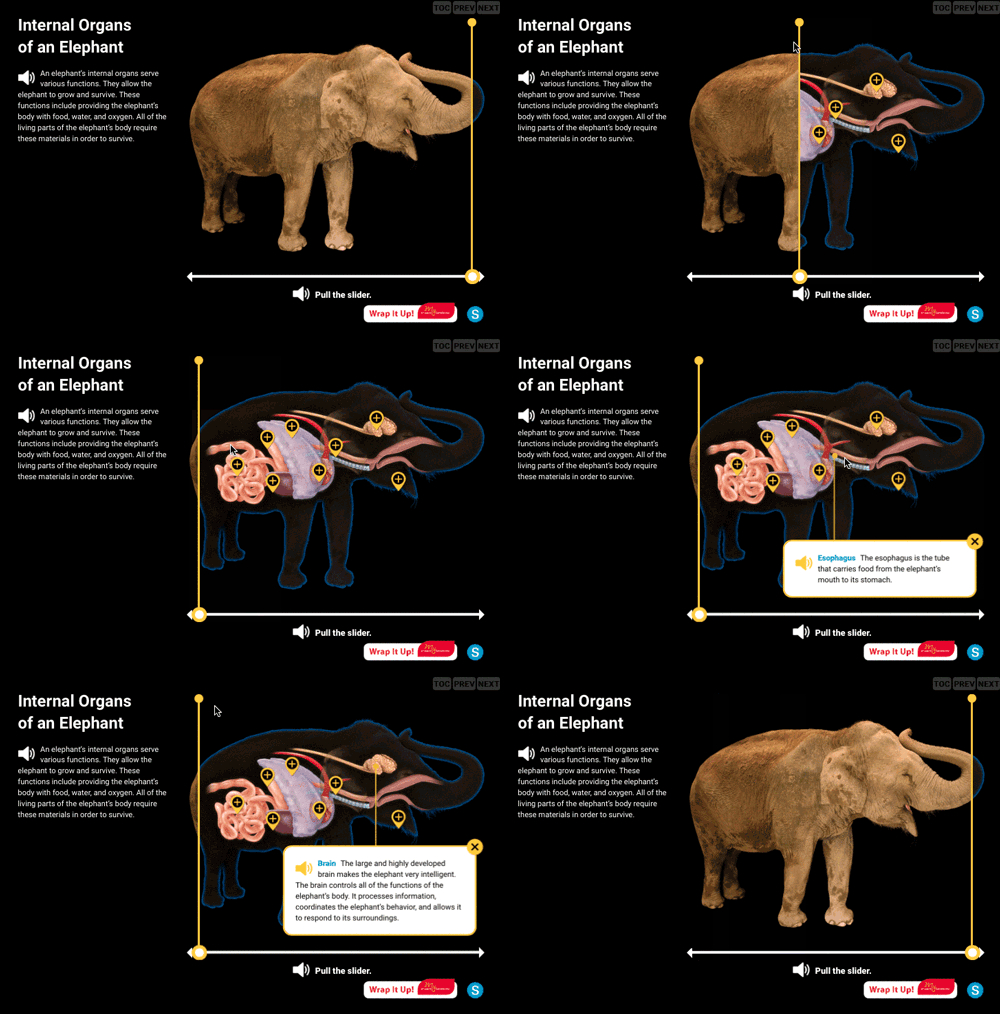
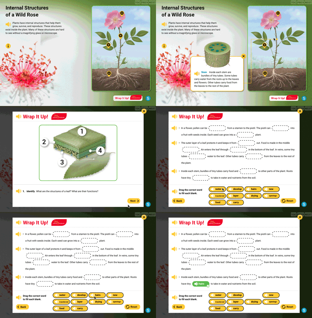
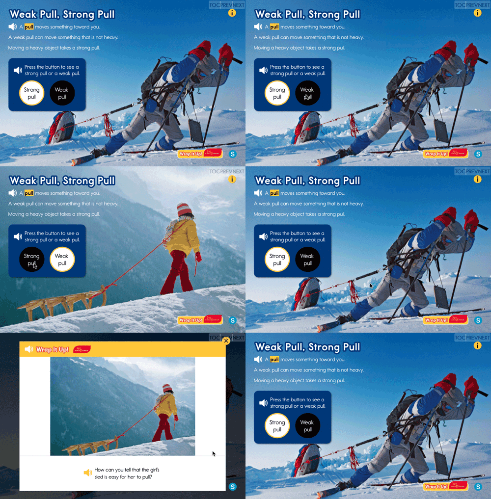
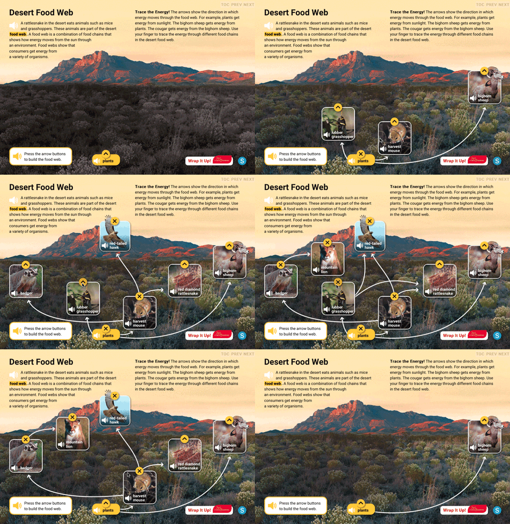
National Geographic Learning came to us hoping to turn their popular line of Grade K through 6 Exploring Science books into fully interactive content with a GUI and touch-screen interface that could be successfully used in either a classroom social setting or by a student studying at home. This new product needed to go above and beyond the original print book version with highly interactive content as a pedagogical aid for learning as well as the inclusion of newly created interactive assessments for each stage of the learning process.
Approach
To tackle this exciting project, we set up a team of the usual suspects; myself representing the User Experience role; our very talented Design Director for the visual side; our intrepid Instructional Designer for all the pedagogical stuff and of course a Project Manager to keep us all in line.
The first order of business was the Discovery Phase where we sat with the client for a couple 9-hour days and went through a few titles and brainstormed ideas and blue-sky concepts. We then took this stack of notes away and converted these into what we felt were the 20 best interactives that could be used throughout the line of content in a variety of fruitful ways.
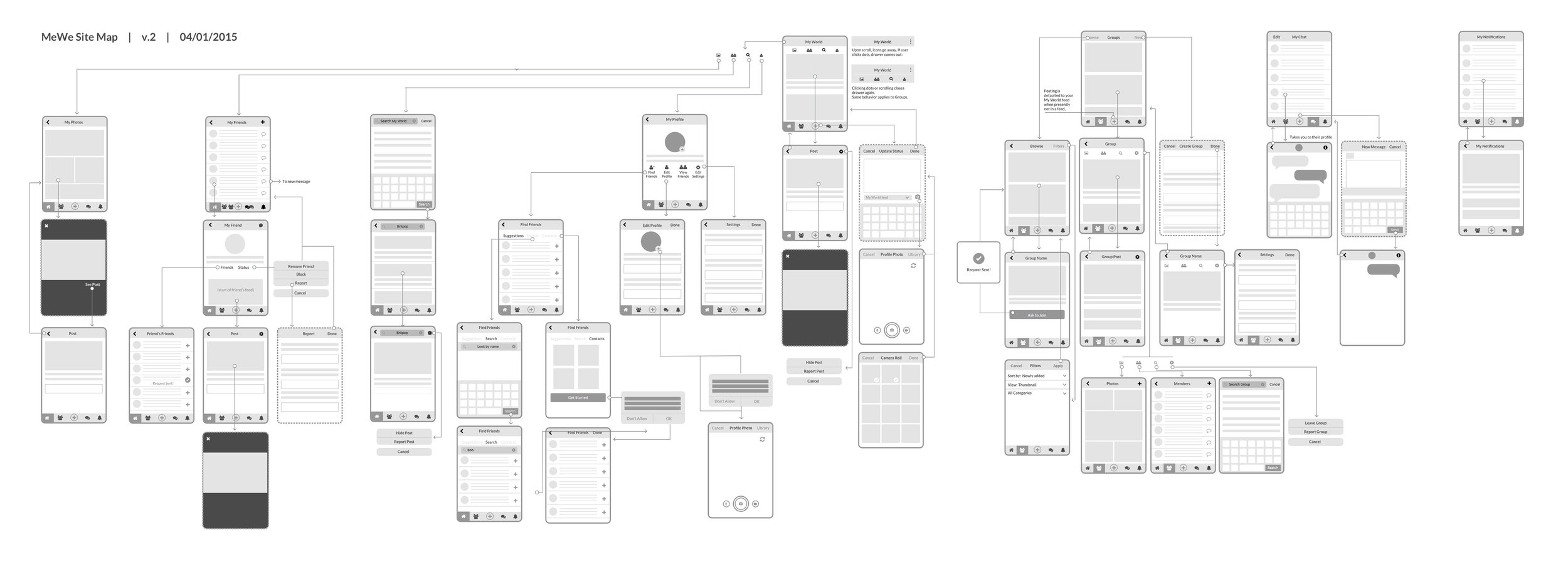
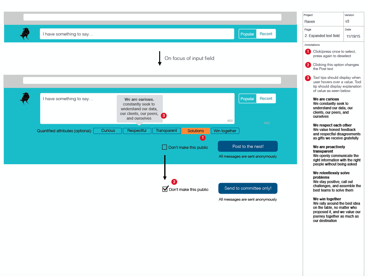
I then went to my UX cave and created wireframes, and with the help of the developers, a few working proof-of-concepts to show the client the value of these interactives as well as how they would function in order to get stockholder buy-in before production commenced.
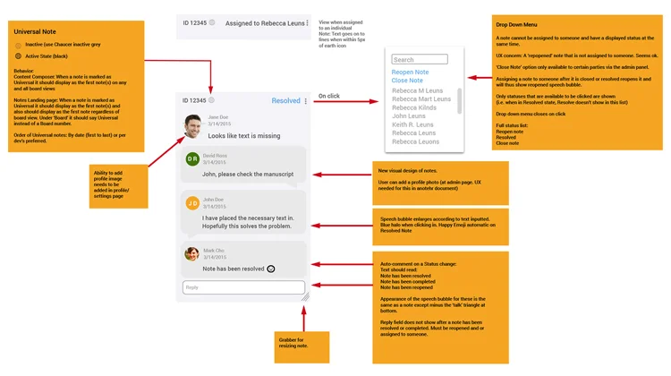
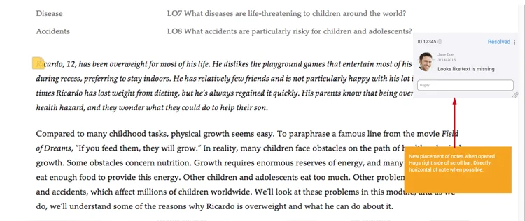
After any necessary iterations, the wireframes were expanded and modified to create functional specification documents that the developers could use to properly build the products.
As these ePubs had a lot of moving parts, the functionality of these interactives under the numerous states and circumstances they could be involved in had to be spelled out quite precisely so that the developers knew exactly what to build, the client knew what to expect, and both our and the client’s QA departments knew exactly what was considered the correct behaviour. We also needed to ensure that everything in these ePubs conformed to WCAG usability standards in both UX and visual design as stipulated by the California School District's codes of approval.
Lastly, as some of the content would be used by children as young as 6 years old, we had to ensure that the interactivity was appropriate in it's functionality for touch by smaller and less dextrous hands. The Kindergarten version needed to have a much simpler UI which consisted of more obvious interactive elements and larger and simpler touch interfaces.
Results
I believe we were all thrilled with the finished product. It was been since translated into Spanish and last I heard it was up for an award for Best Science Instructional Solution. And the client was given a totally comprehensive 223 page functional spec document for reference/archives.


